Website Design
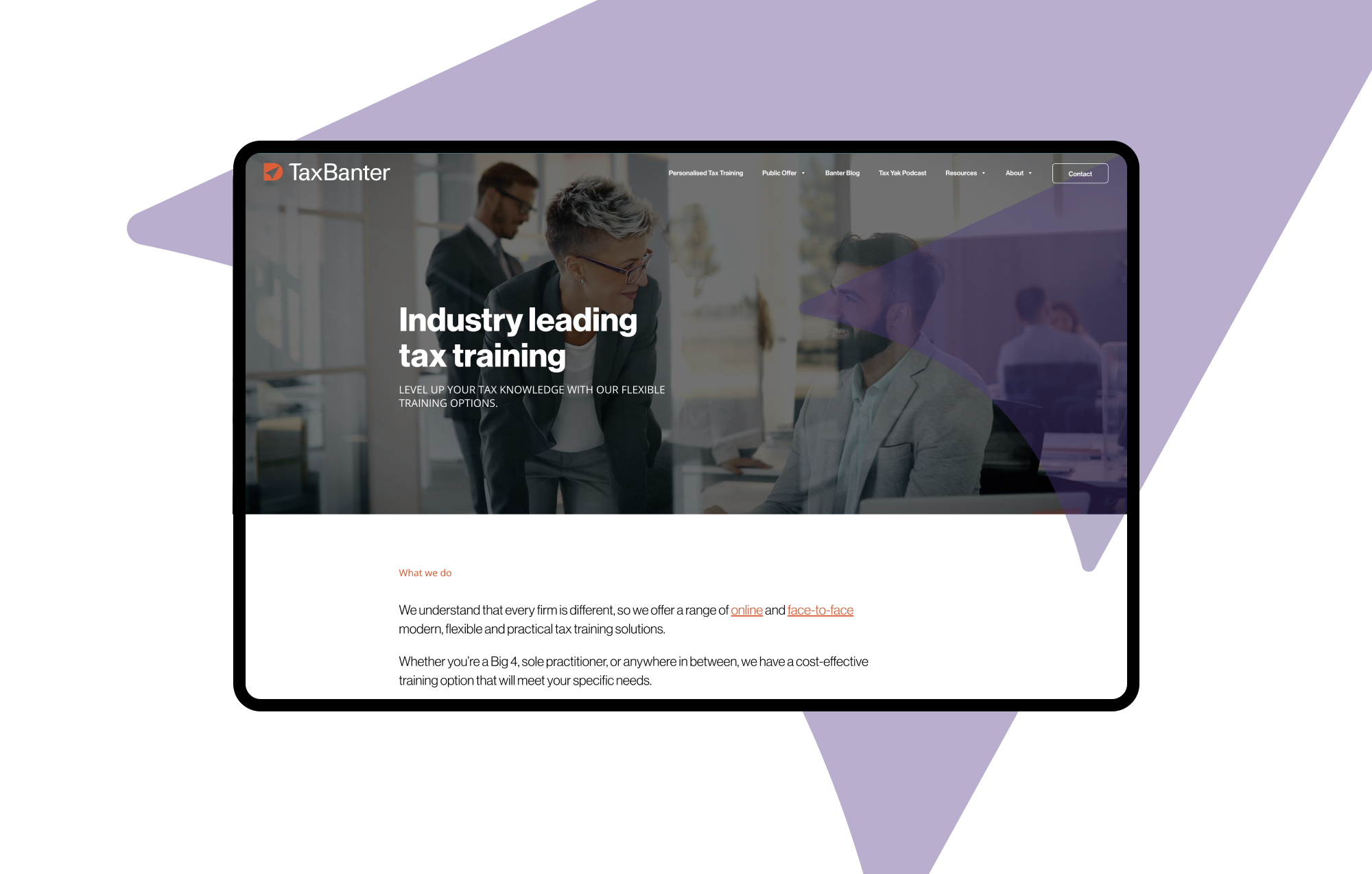
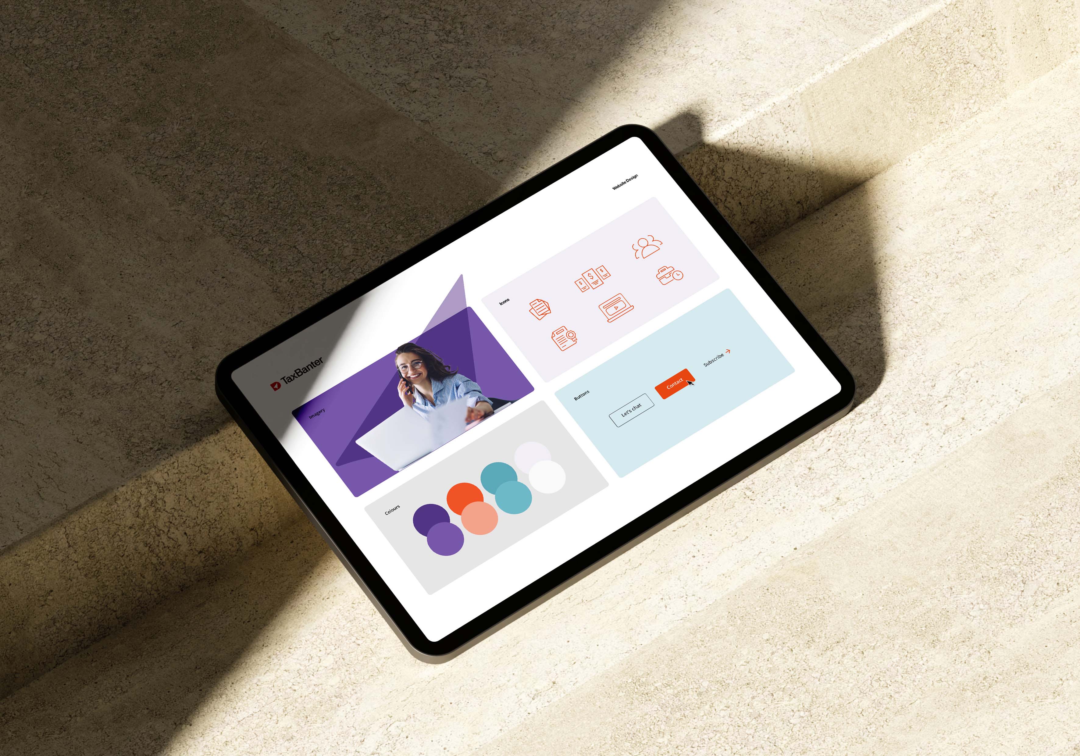
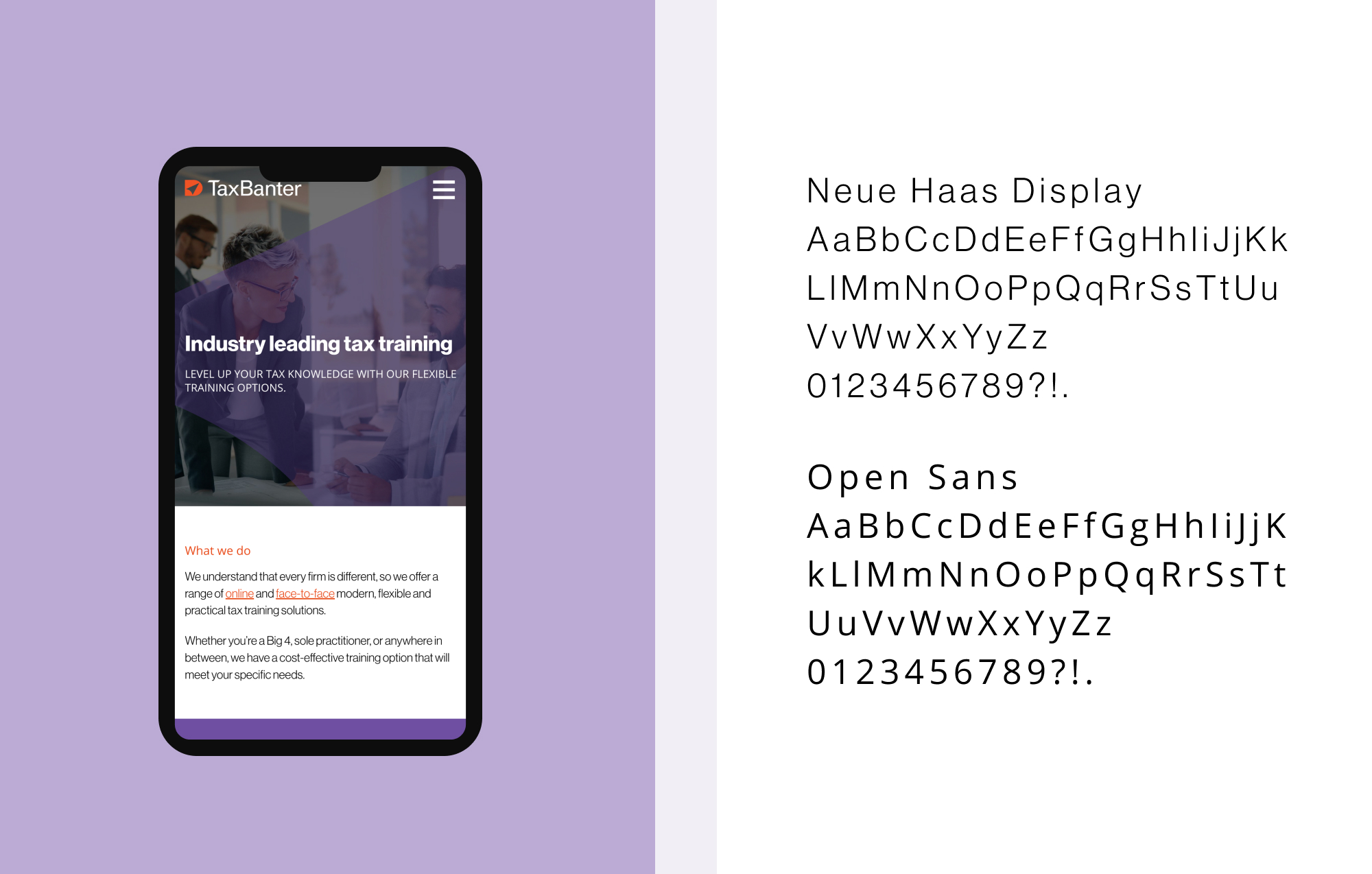
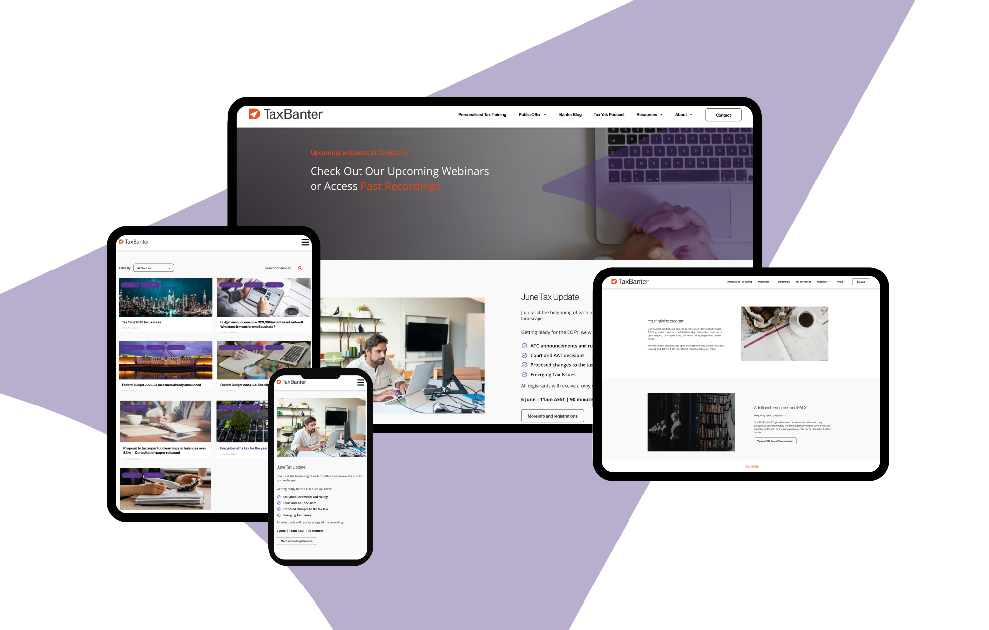
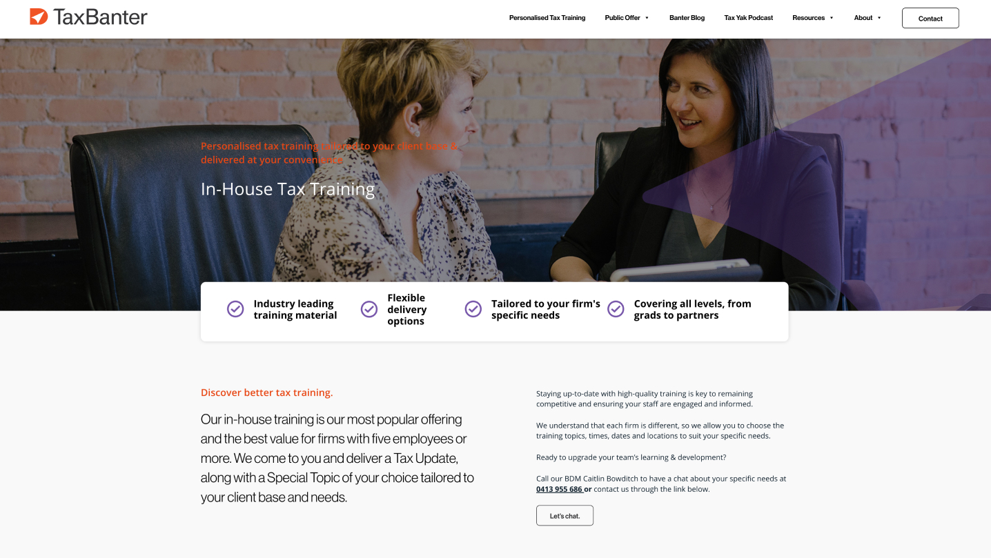
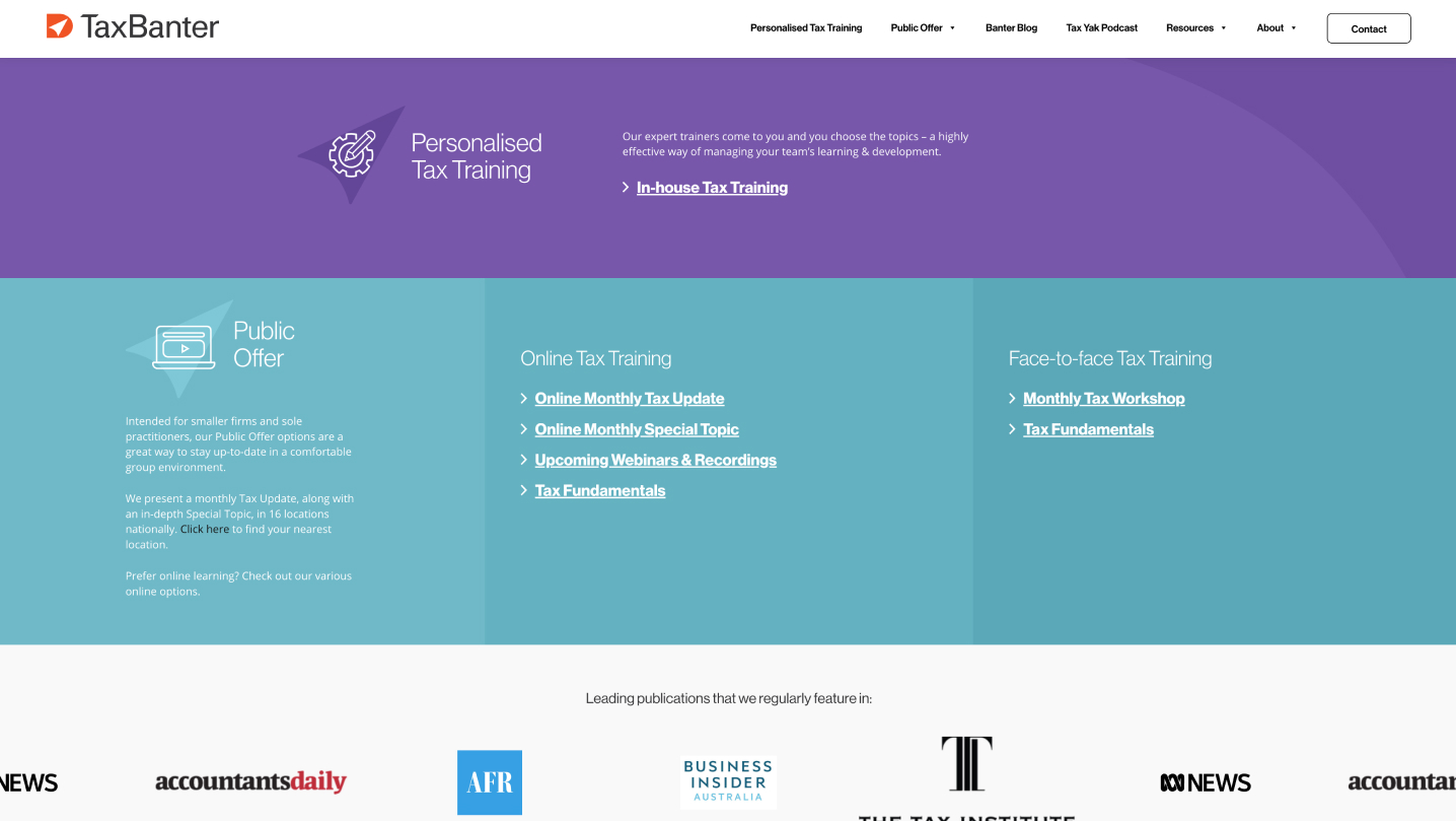
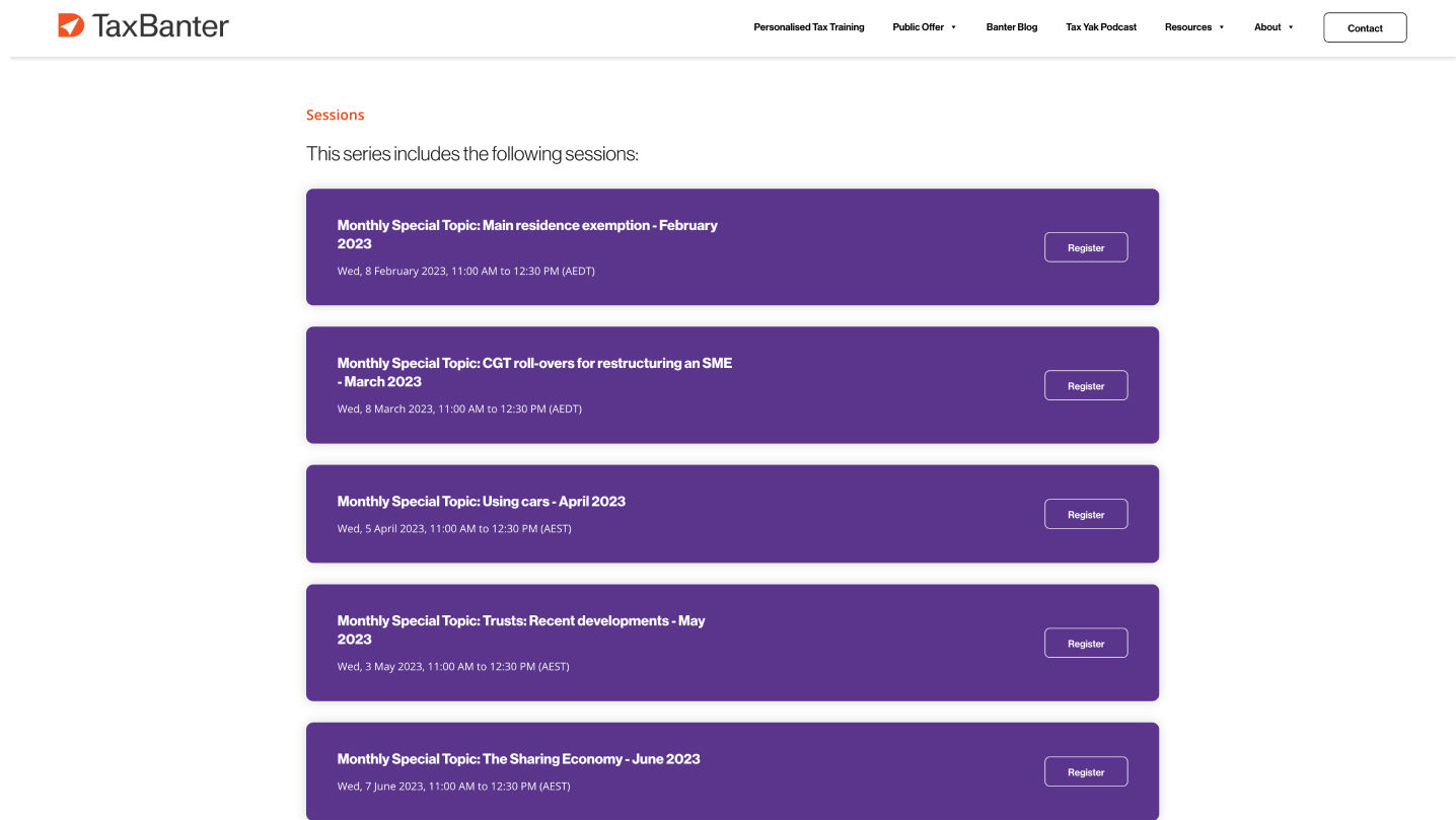
We completely redesigned and rebuilt Tax Banter’s website to reflect their new branding. Our team created a user-friendly interface that showcases both the online and face-to-face training, with detailed landing pages that seamlessly integrate with the training service pages and incorporate related blog articles to enhance the overall user experience.
One of the highlights of the website is an interactive location map, where users can select their location and be directed to the relevant seminar page. In addition, we took care of all the content integration, ensuring a hassle-free user experience for the Tax Banter team. The result is an easy-to-navigate website that successfully incorporates a large amount of content while maintaining a polished and visually appealing design that perfectly complements TaxBanter’s new branding.
