10 Things To Avoid On Your Website
We've complied a list of 10 things you should avoid putting on your website (plus the best ways to fix them).
2018-01-09 • Updated: 2022-12-08
Whether you’re preparing to launch a new website, or just curious about how to better promote your business online, these are the things you should avoid (and the ways you can fix them)….
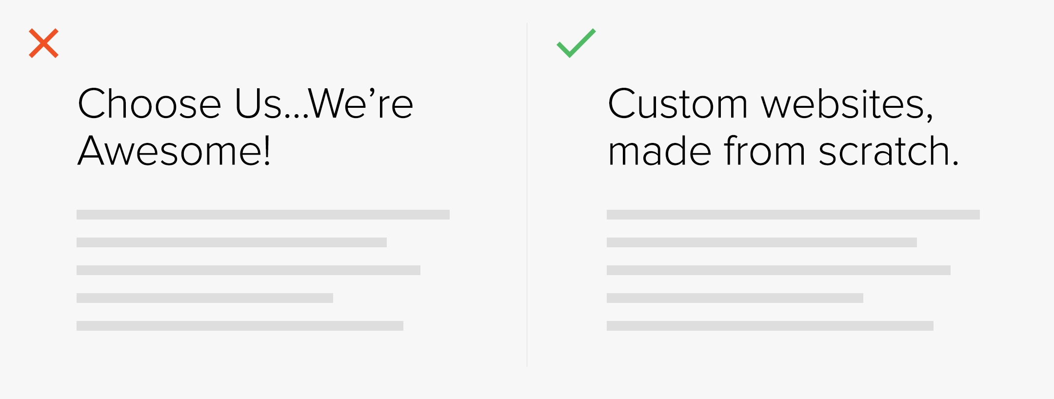
1. Vague Headlines
Your homepage header should be the pinnacle of your website. It should be explicit in telling your visitors who you are and what you offer. Often a homepage headline will offer a general statement about quality about value, and can fail in explaining what your business actually does.
Solution: Try to develop a short description that includes the title of your trade. So… “custom made for your business” would become “custom websites made for your business”.
2. Social Media Icons
Social media traffic is great, but only if it’s flowing toward you. When visitors leave your site and go to a social network, they are unlikely to return. You want to make sure your visitor has fully experienced your website before moving on to your social media.
Solution: Move social media icons into your footer, rather than your header. Try avoid colourful icons, and instead keep them minimal in colour while still staying visible.
![]()
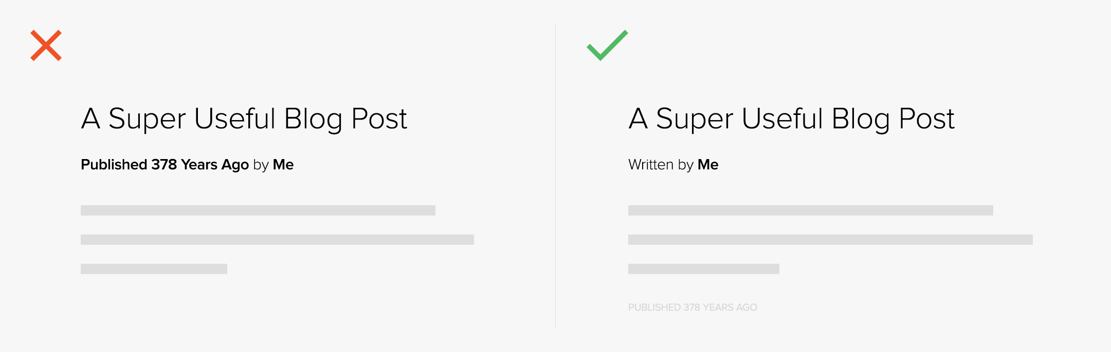
3. Dated Blog Posts
If your content strategy is to write and share helpful “how to” articles that are useful to your audience and don’t go out of style, then why show the date? Adding dates, especially to the top of your blog post, can make the content seem old or out-dated.
Solution: Remove the date stamp from your post, or move it to the bottom of the post. Out of sight, out of mind.
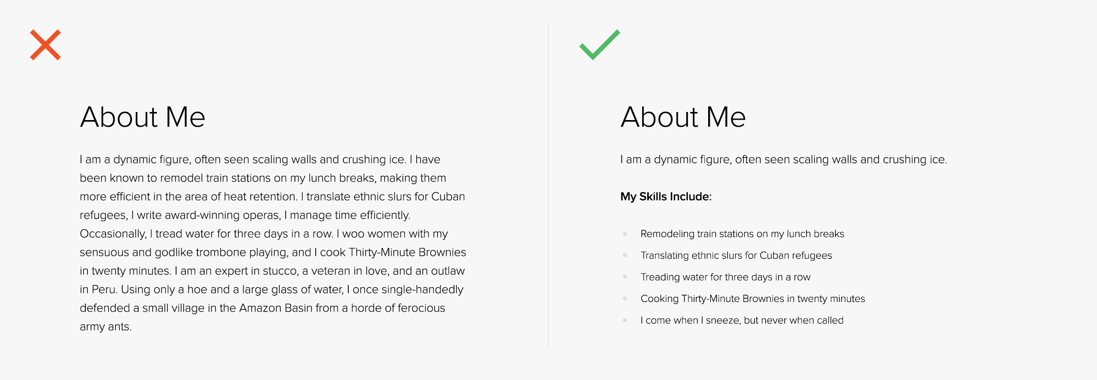
4. Long Paragraphs
Some visitors read, but all visitors scan. Having short paragraphs of information is the best way to utilise visitors scanning your website. Don’t overwhelm your visitor with endless information that, really, they don’t need to know.
Solution: Keep your paragraphs under three or four lines or add formatting to your content to make it more scannable (ie. bullet points or internal links).
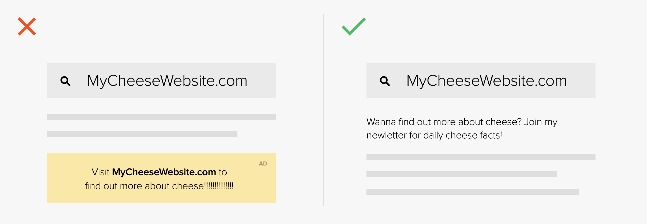
5. Your Own Ads
We have all conditioned ourselves to look away from ads. If it looks like an ad, we ignore it. However, many business owners will still display banner ads for themselves on their websites. It’s the worst way to get your visitor’s attention.
Solution: Promote your content within your content rather than through obvious and obstructive banner ads or add simple call to action text above your footer.
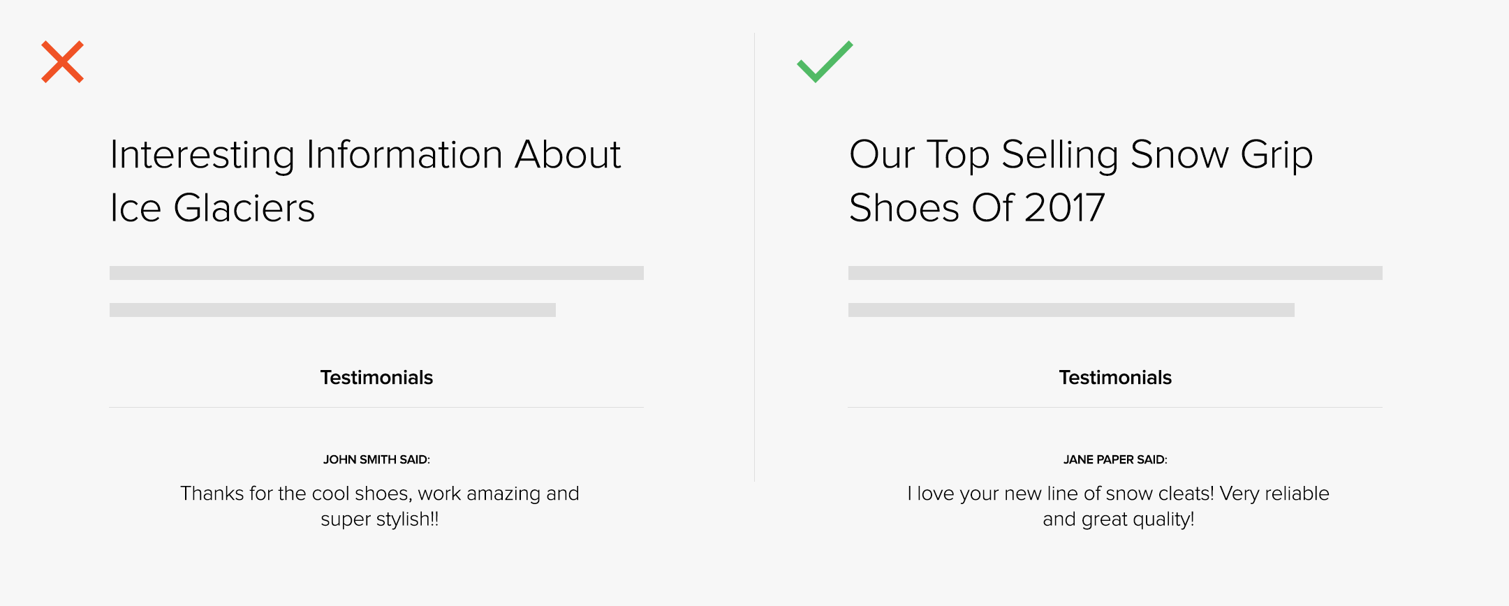
6. Testimonials Page
Testimonials are “social proof” which is a key aspect of web design and neuro-marketing. However, your testimonials should be close to the claim. If it’s on a separate page, or out of context then it’s weak proof and virtually meaningless.
Solution: Add testimonials to every page of your site, keeping them in clear context of the context of the page.
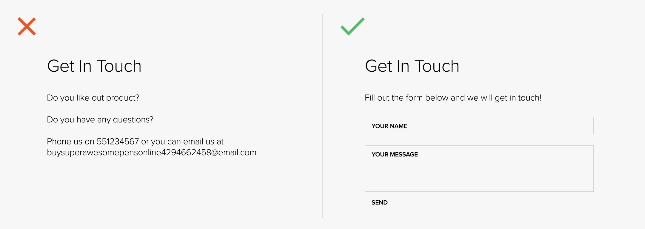
7. Email Links
Email links fail on every criterion for good marketing, from messaging and routing to usability and tracking. Not only that, but email links are spam magnets. Spammers use robots that scrape the web for email addresses. So that email link on your website is filling up your spam folder.
Solution: Remove every email link from your website and add a simple contact form instead and consider setting up an auto-response email, telling your new leads when you’ll be in touch or thanking them for contacting you.
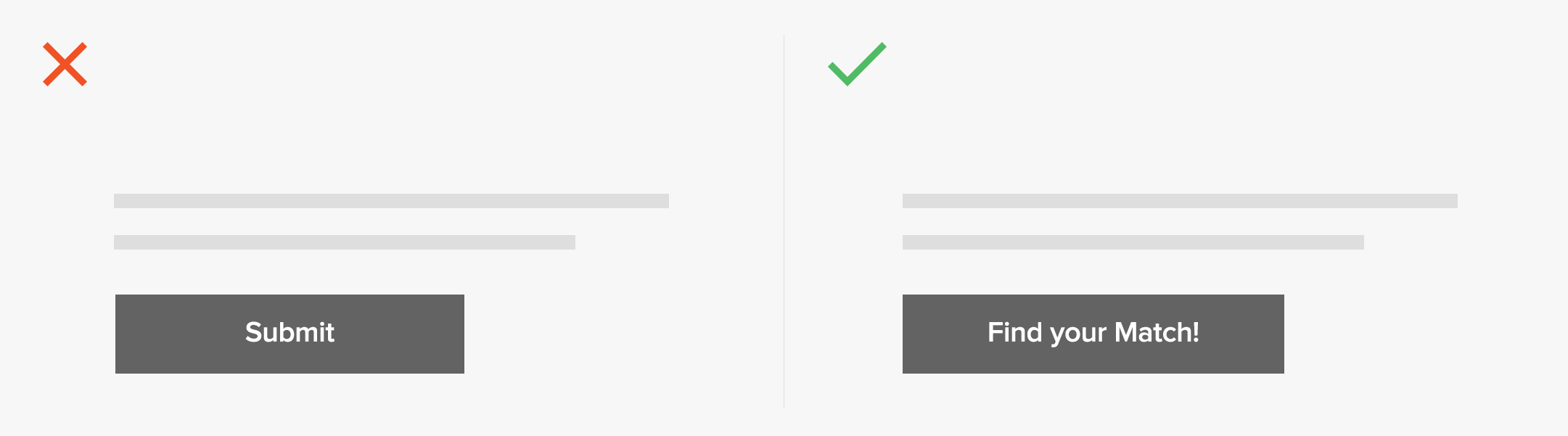
8. The “Submit” Button
A call to action is an opportunity to tell the visitor what benefit they’re about to receive. Or, at least, what action they’re taking. A good call to action is specific and benefit driven. A bad call to action says nothing. For example, a button that just says “submit.” The more descriptive the call to action, the higher the conversion rate
Solution: Use personable and description language to highlight the benefit of participating in your call to action.
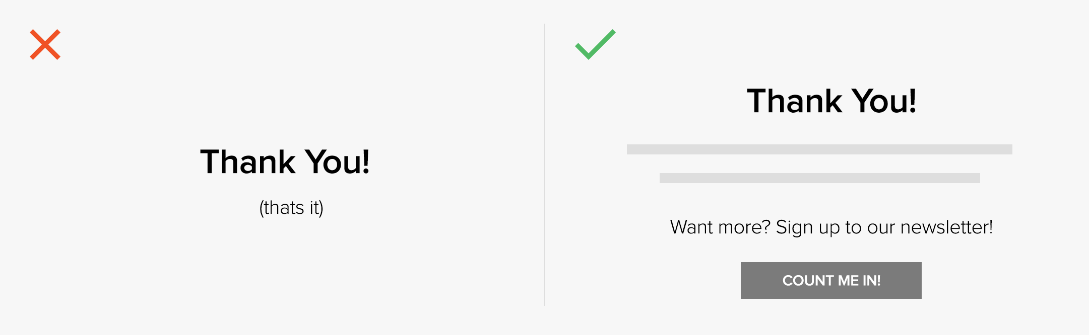
9. Dead End Pages
If your page only consists of two lonely words at the top of the page, it might as well say “good-bye”. Right at the peak of their interest, just as you convert them…you give them nothing. But if the thank you page offers the visitor a subsequent action, they’re likely to take it.
Solution: Give the visitor another subsequent action to take. You’ve already gotten them this far. Then, find and fix every dead end on your website and keep visitors constantly flowing.
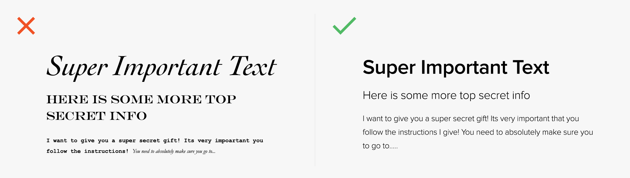
10. Unreadable Fonts
There are many font options that will give your brand a professional and sophisticated look, but you want to make sure you are making a comfortable experience for your visitors. The overuse of fonts and text sizes can distract your visitor from the real message you wish to give across.
Solution: Keep it minimal. Use a mixture of 3 or 4 varying text sizes and choose a maximum of 2 (complimentary) fonts to use across your page.

Written by Dean Oakley
Dean founded Thrive Digital in 2006 and has worked in the design and development space ever since. He received 1st Class Honours in a Bachelor of IT and oversees all technical aspects of our projects.