12 ChatGPT Prompts for Website Design: Desktop Mockups, Mobile Layouts and Client Presentations
Explore 12 practical ChatGPT prompts for quick website mockups, from desktop redesigns to mobile layouts and client presentations. A useful starting point for your next design.
2026-10-02
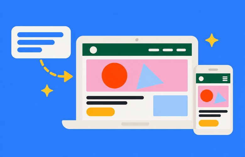
At Thrive, we often use AI to create quick website mockups for inspiration or to give clients an idea of a new direction. We usually start with a screenshot of the existing site, then explore the desktop design, mobile layout and a few variations.
These 12 prompts are starting points for design images. Upload your screenshot first, replace the details in square brackets and use an image generation option. Add a separate logo file if you want to preserve the existing branding.
Start with a screenshot
Capture the top of the homepage so the logo, navigation and main content are visible. Add a sentence about the business, its audience and what visitors should do next. For follow-up prompts, keep working in the same conversation and refer to the version you like.
1. A quick website and logo redesign
Redesign the website and logo in this screenshot.
Keep the business name and core offering.
Show only the top of the desktop homepage, including the header and hero.
Create a fresh, modern design image and present it in a modern laptop
on a simple background. Keep the screen large and easy to see.
Generate an image, not code.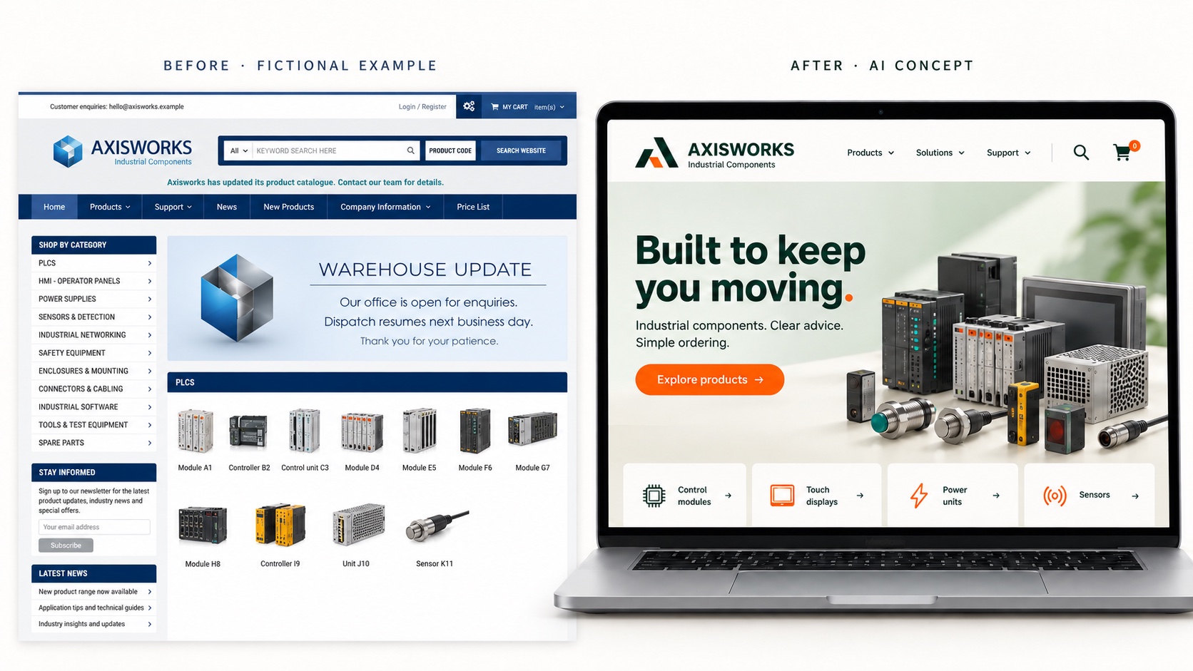
2. Mobile homepage and open menu
Now show the mobile version of this design.
Create two phone screens side by side at the same scale.
Left: the top of the homepage.
Right: the mobile menu open, with navigation, a close button
and the main enquiry button.
Keep the desktop concept’s branding and imagery.
Rearrange the content for mobile with readable text and generous buttons.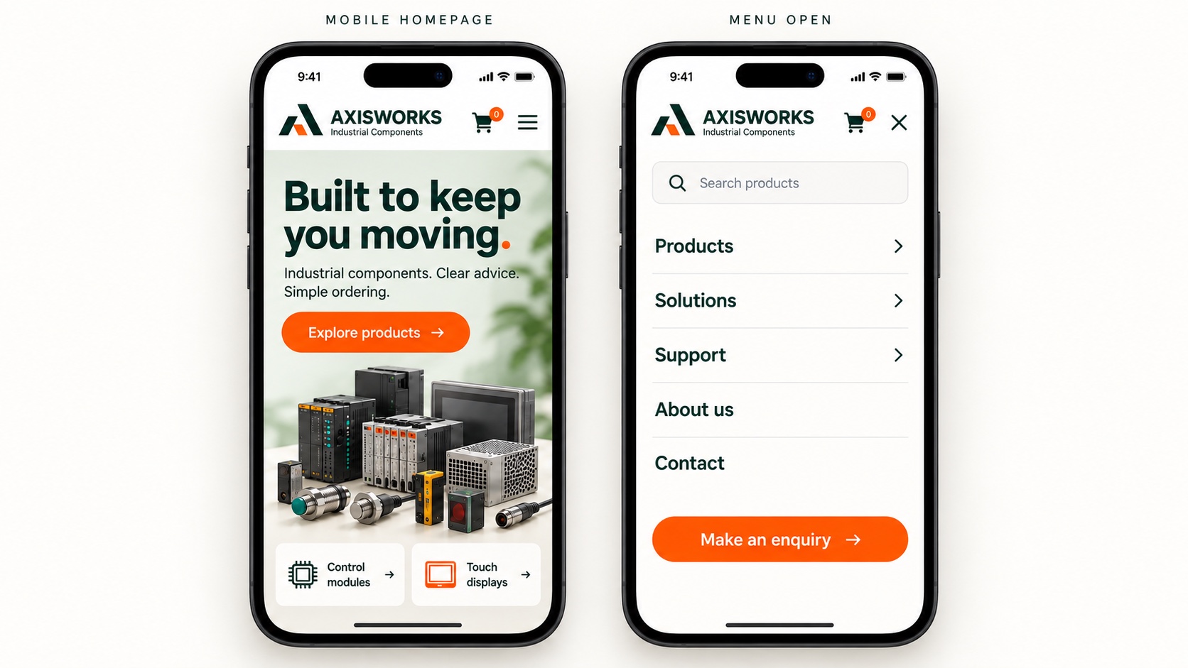
3. A more detailed creative brief
Using this screenshot, redesign the homepage for [business],
a [business type] serving [audience].
The main goal is [enquiries / bookings / sales].
Keep the supplied logo. Use [colours], [typography style]
and photography showing [subject].
Headline: “[headline]”. Main button: “[button label]”.
Show the header, hero and start of the next section in a laptop.
Create a design image without invented reviews, awards or statistics.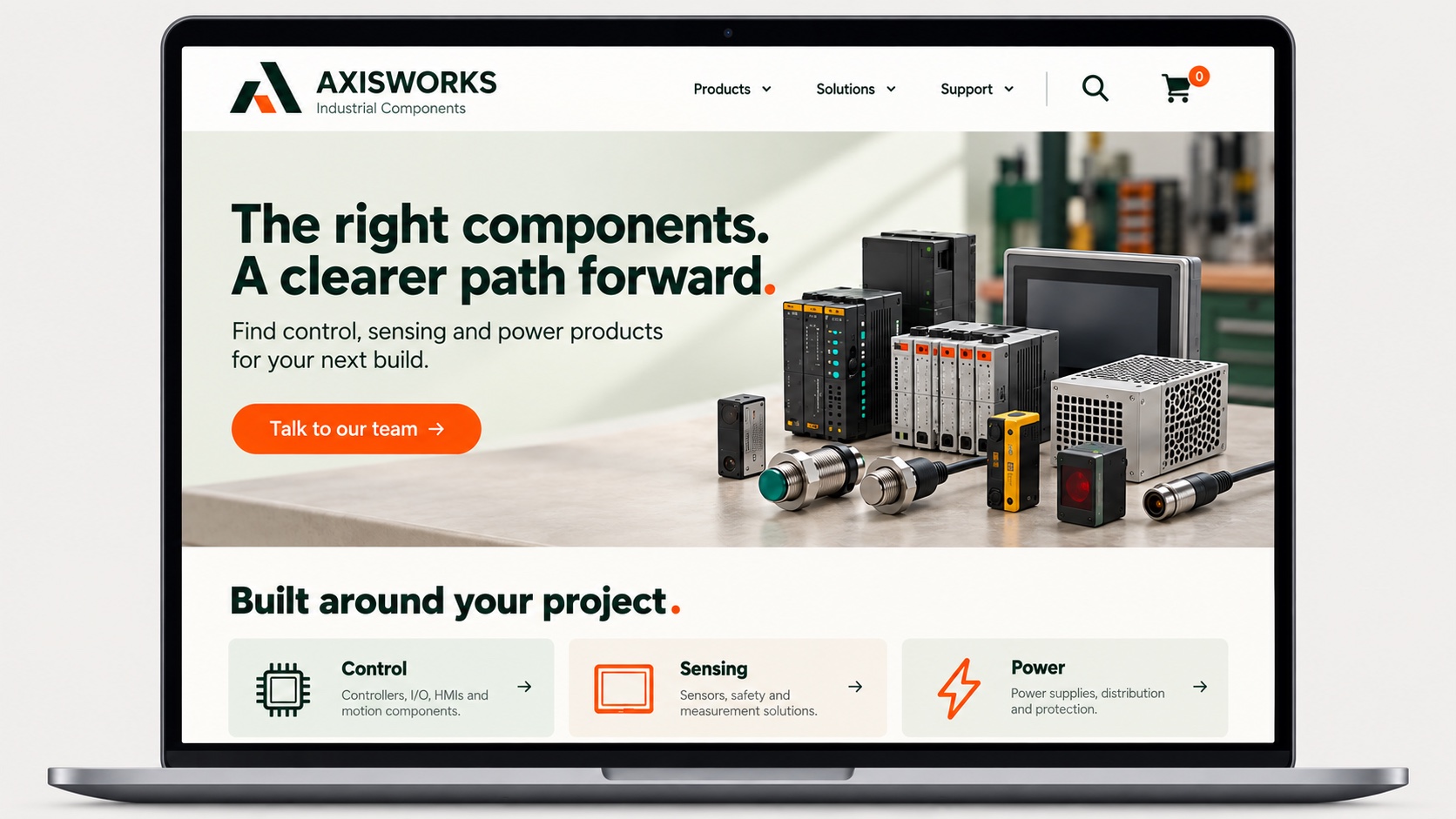
4. Three different design directions
Use this screenshot to explore three homepage directions.
Keep the logo, headline and main action consistent.
A: calm and editorial, with generous space and one large photograph.
B: bold and energetic, with oversized type and an asymmetrical layout.
C: warm and approachable, with softer colours and natural imagery.
Generate A first as a flat desktop design image.
Wait for me to request B and C.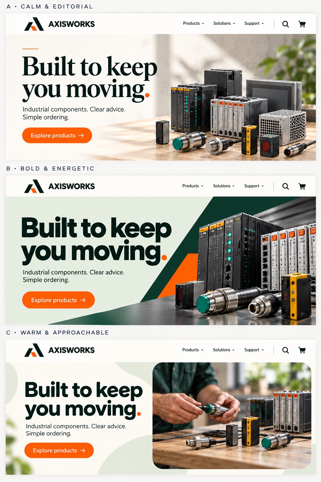
5. Refresh the site without changing the brand
Refresh the website in this screenshot.
Preserve the logo, primary colour and business name.
Simplify the header, improve spacing and make the headline easier to scan.
Use one strong hero image and a clear “[button label]” button.
Show the top of the desktop homepage as a flat design image.
Keep it recognisable to existing customers.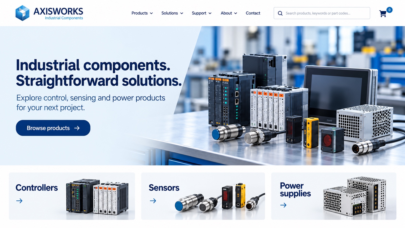
6. An editorial style for a premium business
Redesign this homepage for [business and audience].
Use warm off-white, charcoal and [accent colour], with refined serif
headings, simple body text and generous margins.
Feature a large photograph of [project or subject].
Keep the supplied logo and one clear “[button label]” action.
Show the header and hero in a modern laptop.
Avoid gold effects, decorative badges and excessive gradients.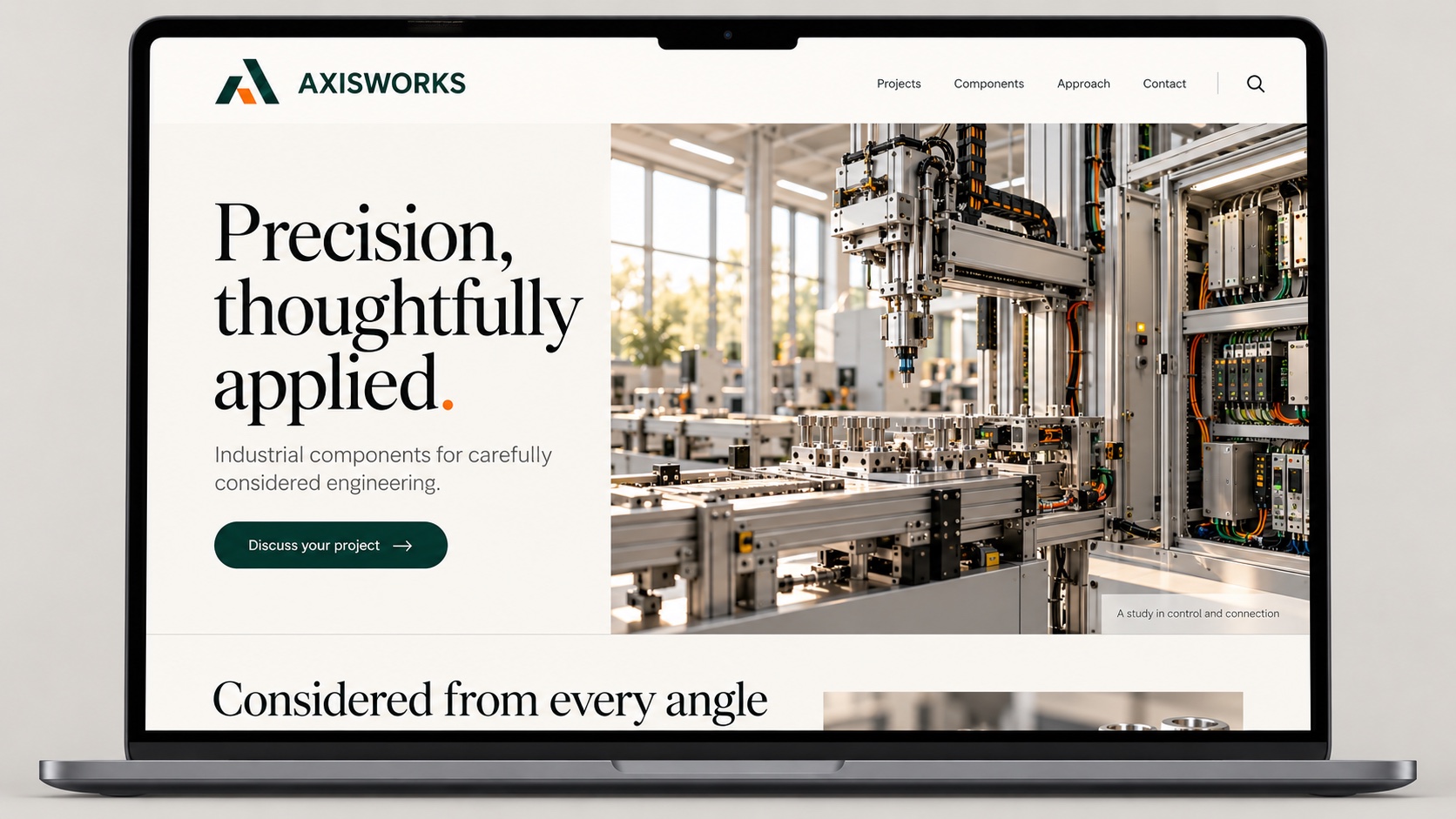
7. A local service business
Redesign this homepage for [service] in [location].
Use the supplied logo and project photos.
Make the service and location clear in the headline.
Include Services, Our Work, About and Contact in the navigation.
Add a prominent “Request a quote” button and [phone number].
Show the hero and start of three service cards as a desktop image.
Do not invent ratings, credentials or guarantees.
8. An online store
Create a fresh homepage design from this online store screenshot.
Use the supplied logo and product photos, preserving product details.
Include category navigation, search and a cart icon.
Feature [collection] with a “Shop the collection” button.
Show the beginning of a product grid below the hero.
Use [palette] and keep the products visually dominant.
Generate a flat desktop image without invented discounts or prices.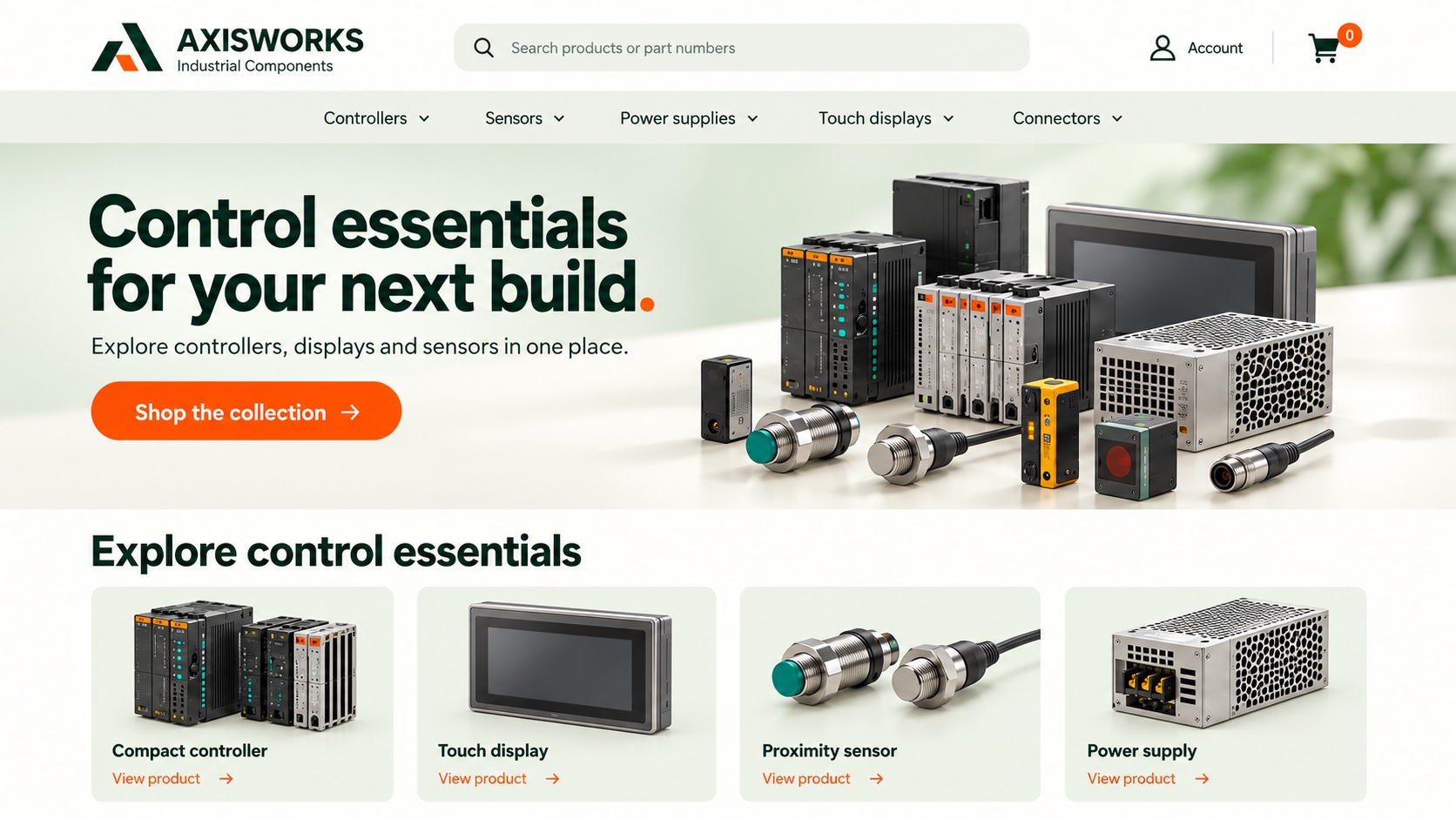
9. A focused landing page
Use this screenshot and branding to create a landing page for [offer].
Audience: [audience]. Main action: [action].
Include “[headline]”, a short supporting line, three supplied benefits
and a prominent “[button label]” button.
Use [image subject] and minimal navigation.
Show the hero and start of the next section as a desktop design image.
Keep the focus on one offer.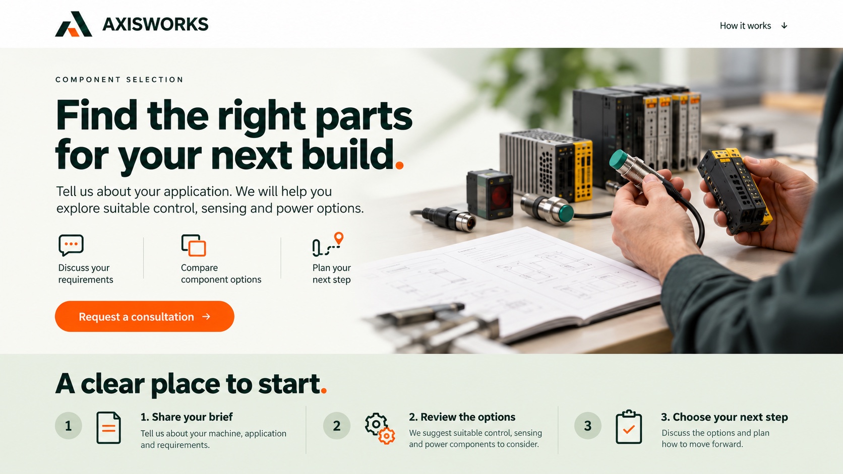
10. Continue below the hero
Extend the selected homepage concept below the hero.
Create a flat desktop image of three sections: [services],
[featured project] and [enquiry section].
Use this content: [headings and short copy].
Match the existing colours, typography, spacing and buttons.
Vary the section layouts and do not repeat the hero.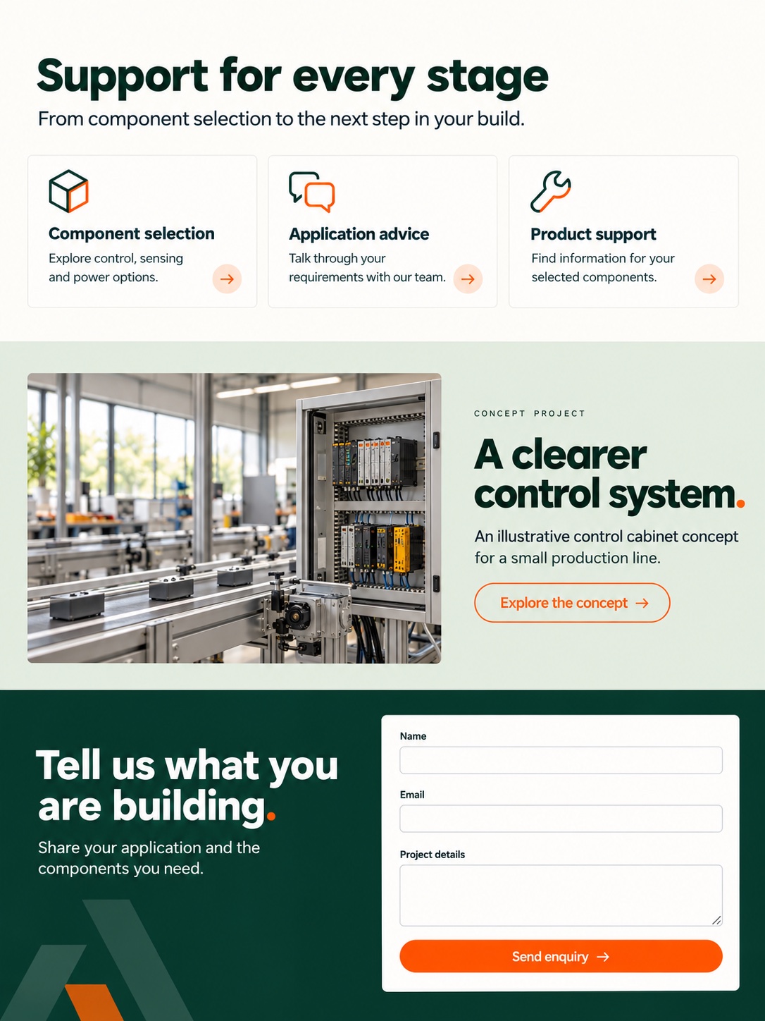
11. Refine one thing at a time
Edit the selected design. Change only [specific change].
Preserve the logo, wording, colours, typography and remaining layout.
Keep the same crop and presentation so the two versions are easy
to compare. Generate the revised image.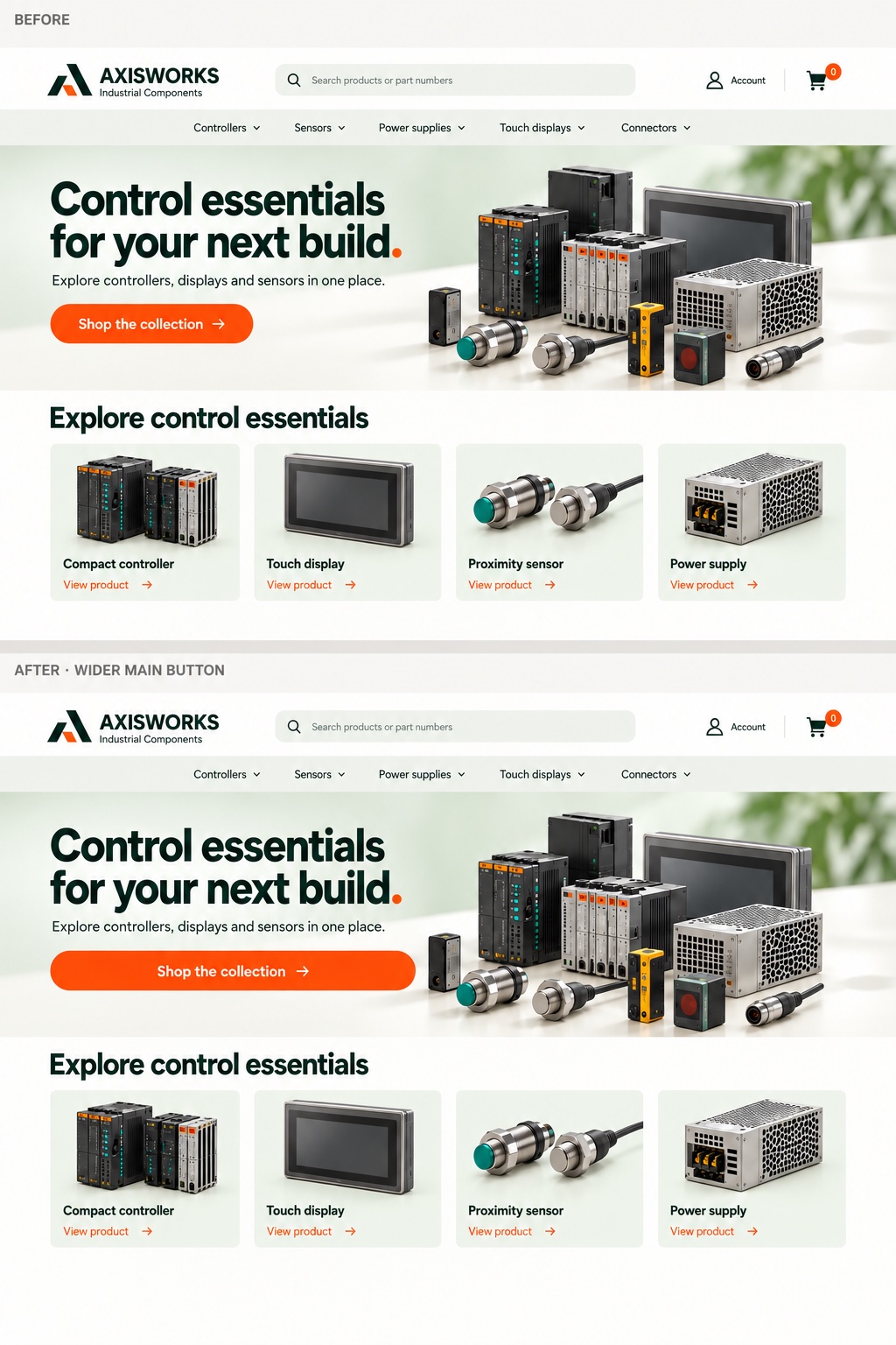
12. Present desktop and mobile together
Use the attached desktop and mobile concepts to create
a simple client presentation image.
Show a modern laptop and phone on a plain warm-grey background.
Keep both screens clear, with minimal perspective and reflections.
Preserve the supplied designs and avoid overlapping important content.
Add subtle shadows, with no extra text or props.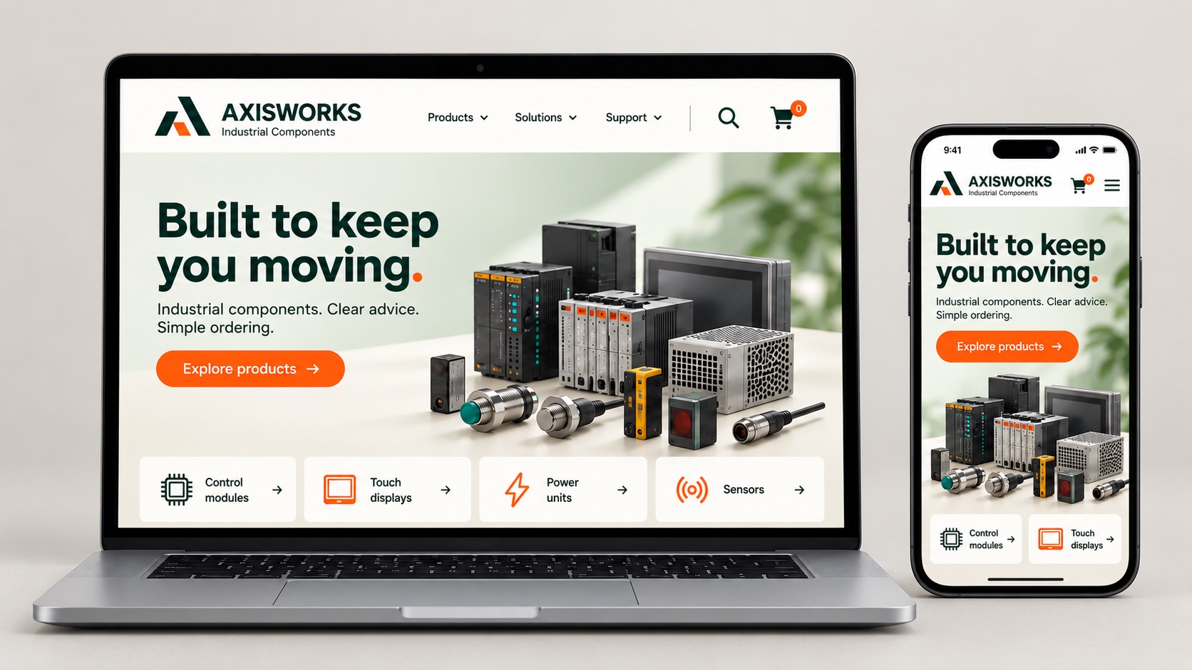
Use the mockup to start the conversation
Check the wording, logo and business details before sharing. Label the image as an AI concept. It can help settle a visual direction, but the responsive layout, accessibility and working interactions still need proper design and testing.
Start with the screenshot, choose the strongest direction and refine one thing at a time. Bring your ideas to Thrive and we can help develop them into a working website.

Written by Dean Oakley
Dean founded Thrive Digital in 2006 and has worked in the design and development space ever since. He received 1st Class Honours in a Bachelor of IT and oversees all technical aspects of our projects.