Branding
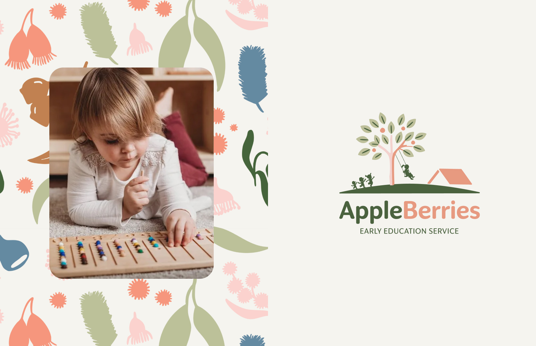
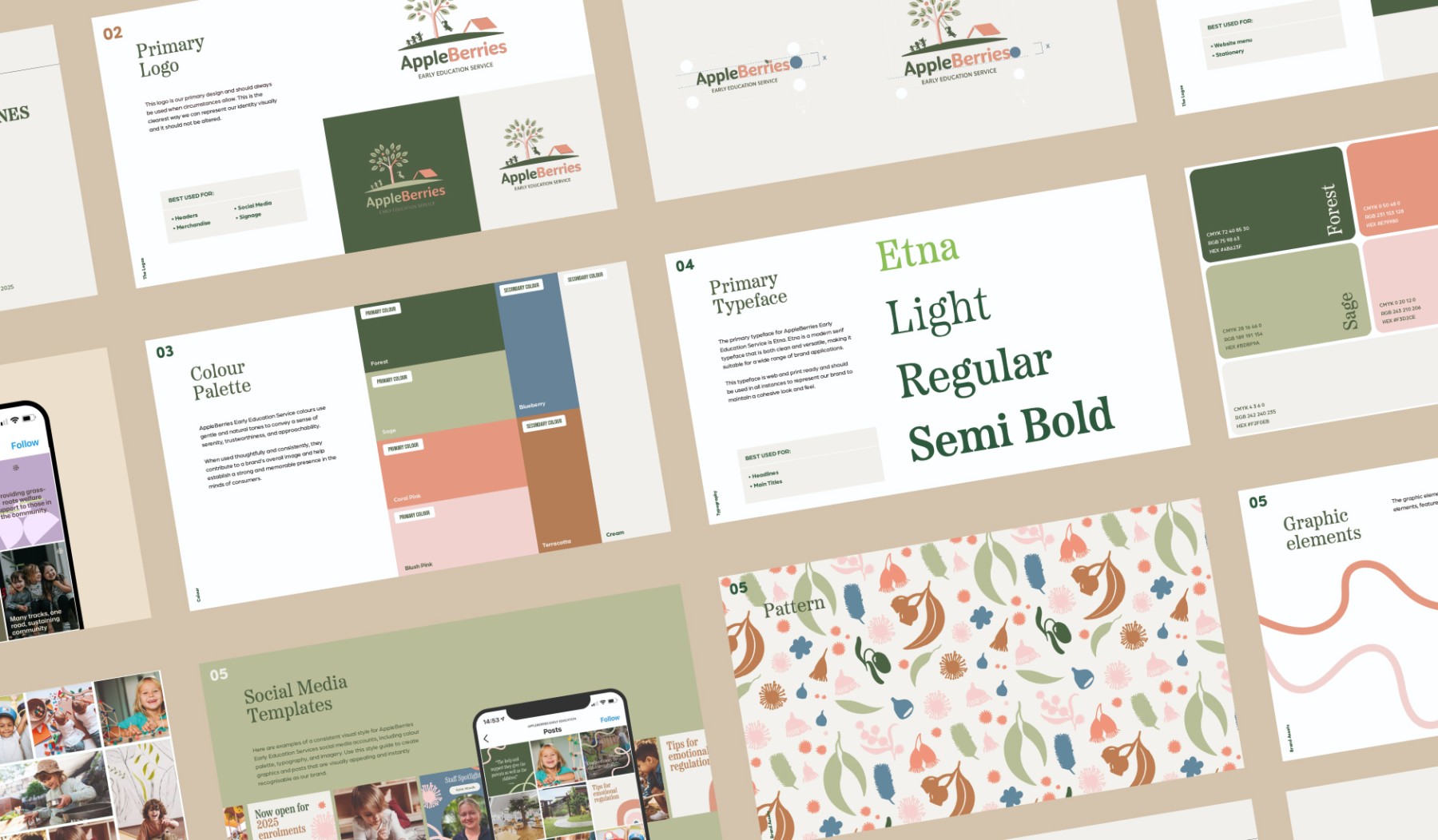
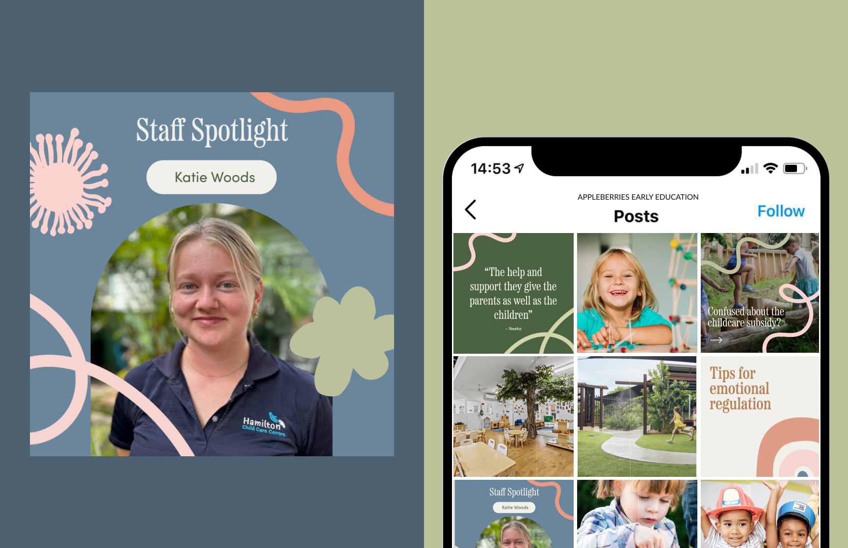
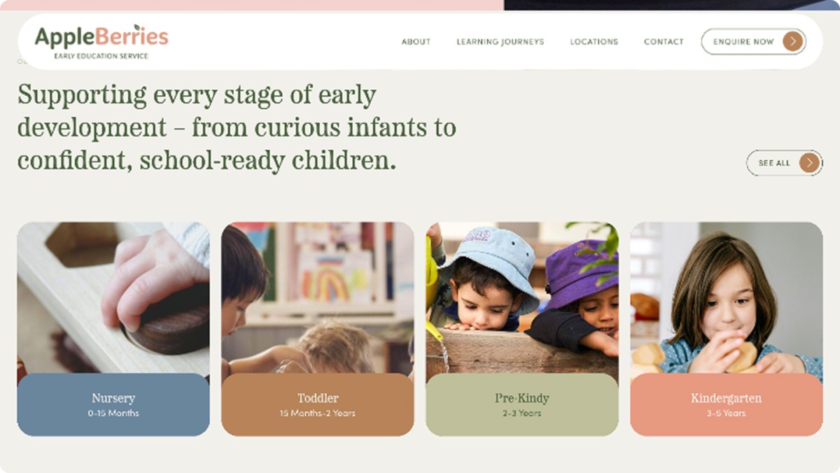
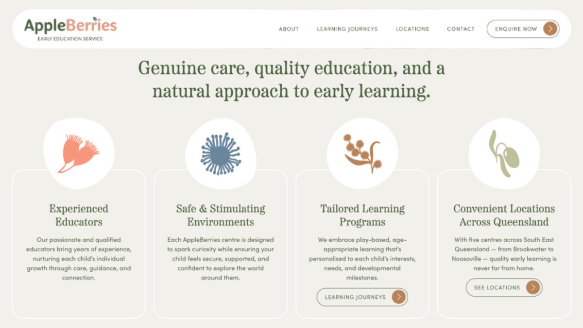
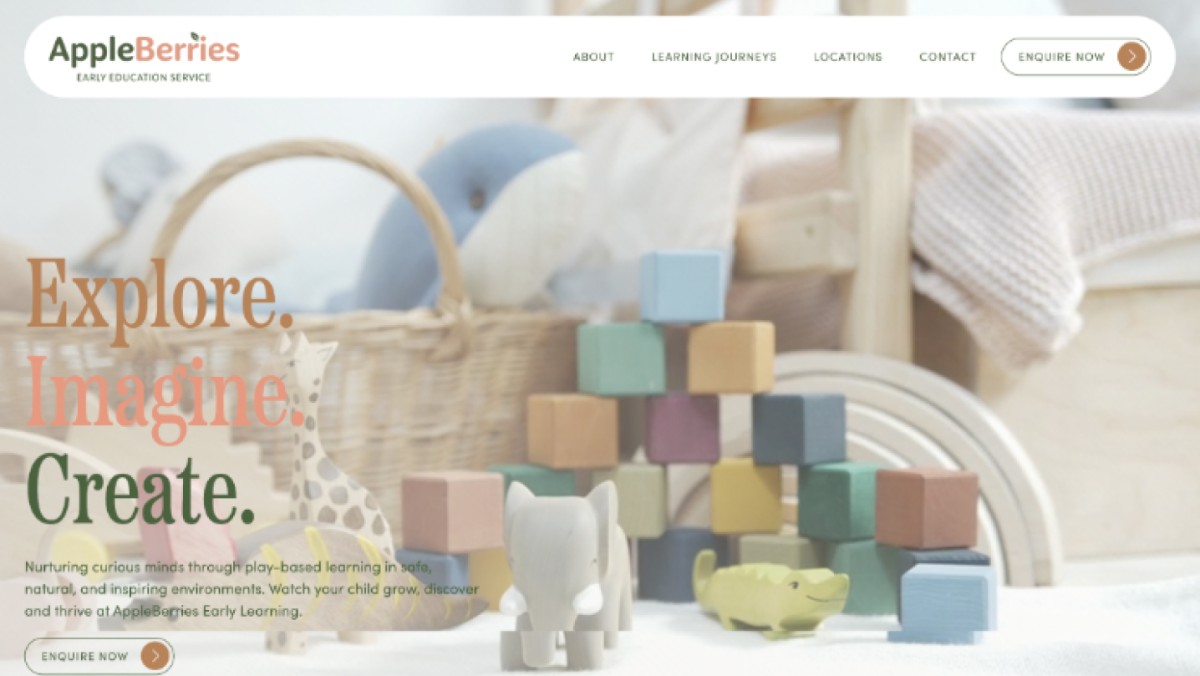
The new identity is built around a logo of children playing beneath a fruit tree with a swing and a small house, in a palette of coral, sage green, olive and soft blue on a warm cream background. A pattern of native flora, gum blossoms, banksia, wattle and eucalyptus leaves, runs through the brand guidelines, signage and stationery and gives the centres a look that is distinctly Queensland, gentle and unmistakably about children rather than corporate childcare.